
Create Individual Checks
A checklist consists of one or more checks. So in order to create a checklist, you must first create individual checks.
Go to the Checks tab within the 24Checklist app and click “New” on the top right.
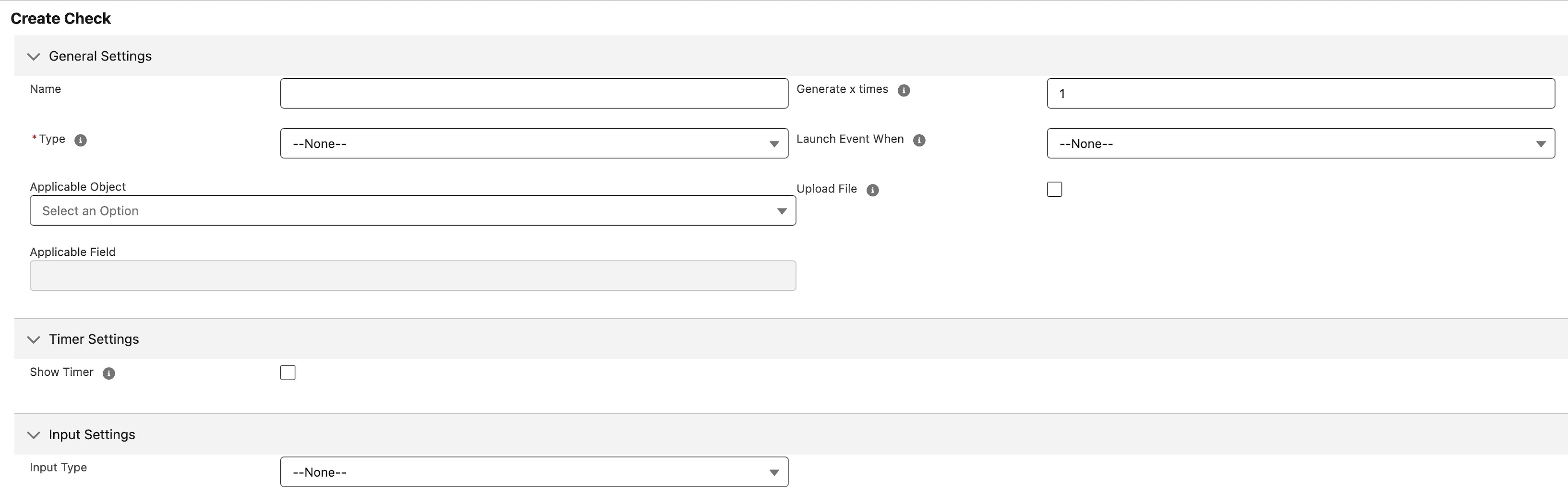
The following settings apply when creating a new check:
General Settings
Name: Name of the check
Type:
Free Input: Select this input type if the only thing you need is to store the results in a Check Results record.
Update Field: The check will update the field of a record as defined below, in addition to storing the input in a Check Results record.
Update Related List Records: Select this input type in case the check needs to update multiple records, in addition to storing the input in a Check Results record.
As an example, assume you have a checklist on the Account object and would like a numeric check to update the Amount field on all related Opportunities. Then you need to select Account as the Applicable Object for your Checklist and to select the Type Update Related List Records for the check and select the Opportunity object and Amount field.
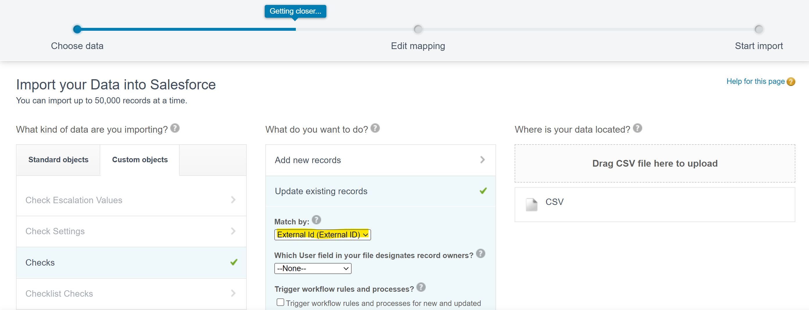
External ID: Can be used to externally reference this check, e.g. when uploading check data.
Generate x times: Generate this check X times within each checklist that contains this check.
Applicable Object: Select the Object for which a field needs to be updated. Leave blank in case the Type has been set to Free Input.
Applicable Field: Field that has to be updated based on the input given by the user for this check. Note that in such a case the check result is stored AND the field is updated. In case the Type is Update Related List Records, multiple record fields may be updated.
Let’s explain this by an example.
Assume your checklist is attached to the Object Account and you want a check to update a Field on Account or a field on a related object (via Lookup). Then use the Update Field Type and use Account as the Applicable Object.
Now assume your checklist is attached to the object Address and you want to update a record field of multiple accounts on the same address then use the Update Related List Records Type and select Account as Applicable object.
In case the Type = Free Input, the user must select the Input Type (see below) for the check and potentially other mandatory parameters for a specific Input Type.
In case the Type = Update Field, the user must specify the Applicable Object & Selected Field. The Input Type will be automatically set based on the Applicable Field type. The user can still specify whether the the field is required and/or set a specific help text.
In case the Type = Update Related List Records, the user must specify the Aplicable Object & Selected Field. The Input Type will be automatically set based on the Applicable Field type. The user can still specify whether the the field is required and/or set a specific help text.
Launch event when:
Check generated: Launch a Salesforce platform event when the check has been generated within a specific checklist.
Check confirmed: Launch a Salesforce platform event when the user has completed and confirmed the check.
Upload File: If this checkbox is enabled, a user can attach a file to the check. The file size cannot exceed 2GB. The uploaded files are stored on the relevant checklist data record.
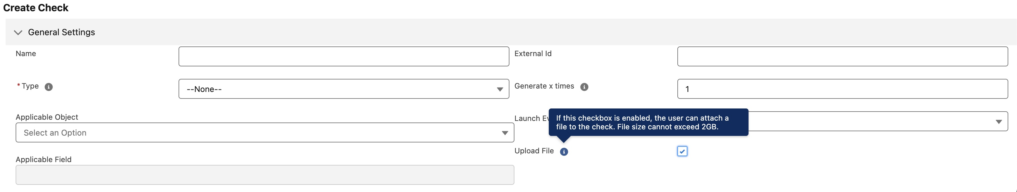
Enable checkbox “Upload File” in order to upload files to a check.
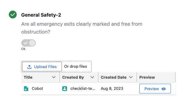
In this case, a file has already been attached to the check. The user can attach additional files by clicking on the “Upload Files” button.
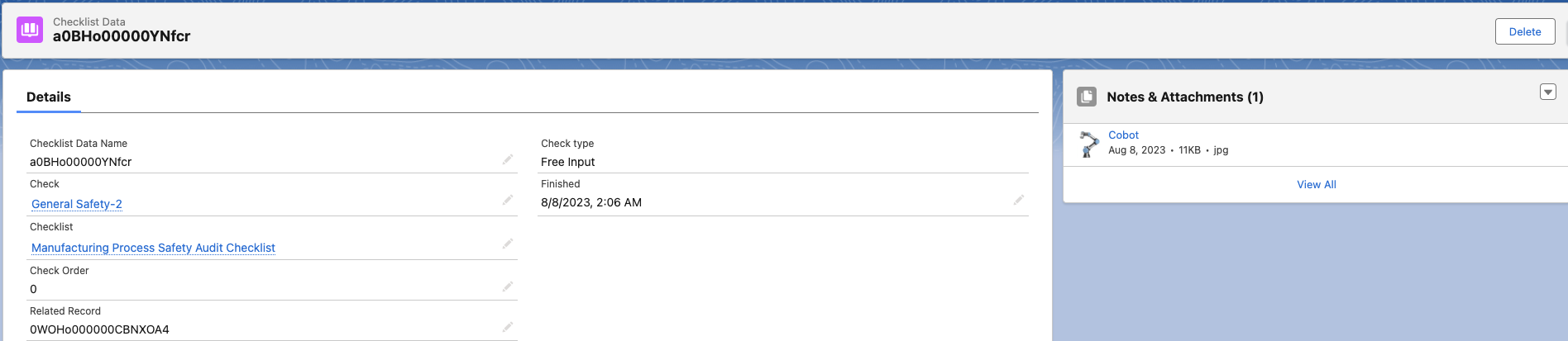
The attached file form is now visible on the relevant checklist data record.
Timer Settings
Timer settings allow you to define time sensitive checks, i.e. checks that need to be completed within a preset time frame. Leave this section blank in case timer settings do not apply to this check.
Show Timer: Check this box in case you want the timer to be visible to the user.
Timer Type:
Count Down: counter decreases
Count Up: counter increases
Launch Timer:
Immediately: the timer is launched as soon as a checklist is instantiated that contains this check.
After Predecessor confirmation: A predecessor is a check that has to be completed before this check can be completed. The timer for this check will be started when the predecessor check has been completed.
Timer Complete Message: The message to be displayed in the timer doughnut when the timer has expired.
Threshold Timer: Periodic time interval, expressed in minutes, within which check has to be completed periodically. The maximum value of the Threshold Timer is 9999 min. When used in a checklist and no input is provided by the user prior to the expiration of the timer, the timer will turn red.
Threshold Timer Input Behaviour: This parameter governs the behaviour once the threshold timer has been exceeded:
EnableInputExceeded: The user can complete the check only after the timer has expired.
DisableInputExceeded: The cuser can complete the check only before the timer has expired.
Launch threshold breach event: Create a Salesforce platform event in case the timer threshold has been exceeded and a user input has not been entered.
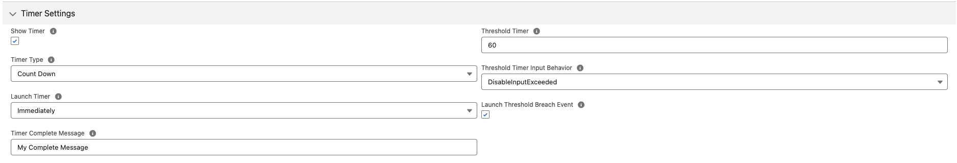
For each check, set your time settings.
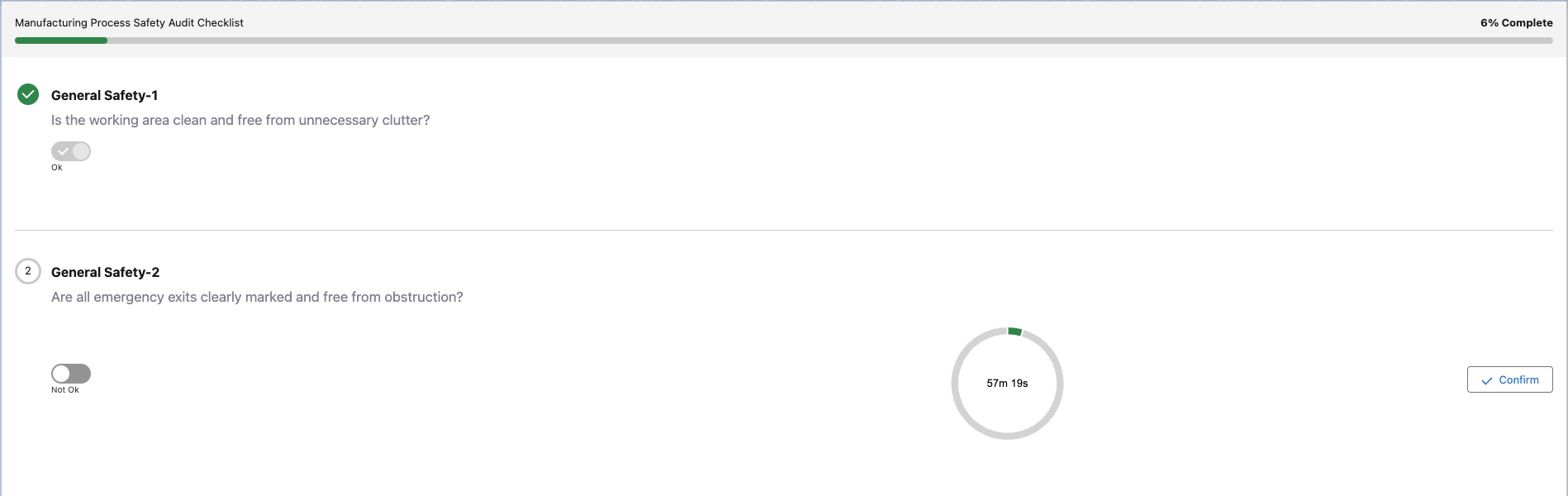
The above settings results in the following check with a timer of 60 minutes.
Input Settings
Input Type:
Checkbox: Create a check with a checkbox.
Text: User can enter free text.
Rich Text: User can enter rich text.
Picklist: Choose input from a dropdown list.
Numeric: The input should be a numeric value.
Picklist Values: define the picklist items. Use a separate line for each picklist item
Input Placeholder:
Input field: The Input Placeholder is a placeholder value presented to the user.
Rich text: The Input Placeholder is a placeholder value presented to the user.
Help Text: this is the tooltip text that is shown when hoovering over the 'i' icon.
Checklist Default Value: When the Input Type is a Checkbox (boolean), the Checklist Default Value sets the default to either true or false.
Decimals: Users can fill in numeric checks with a certain amount of decimals.
Input required: when checked, the corresponding check cannot be completed unless a value is entered. This field is not applicable to a Boolean value (Checkbox Input Type).
Description
Description: Additional description of the check to be shown to the user.
Additional documentation: Additional documentation of the check to be shown to the user.